Adding Value To The User Experience (Spec)
Strategy | UX Copywriting | Editing
FLO is a women’s health app that focuses on helping women understand each stage of their reproductive cycle. I did a spec of FLO’s app. I edited and revised an in-app promotional sequence to highlight the benefits for current users to upgrade to the premium subscription. The sequence has a “story” focused format, and I utilized that format to motivate users to click through the promotion.
Problem / Statement
The current sequence is repetitive and lacks specific and relevant benefits to encourage users to upgrade their subscriptions.
——–
How might we encourage users to upgrade their subscriptions to have a personalized experience?
Goal
My goal was to revise and update the microcopy to make it more engaging. Another goal was to define the concerns of the user and then map out how the FLO app can improve their daily lives.
What I did
- Researched app’s subscription elements
- Incorporated additional information to show the value of the subscription
- Revised and rewrote listed benefits
- Updated calls-to-action on the button
- Utilized the format to create a sense of familiarity
Identifying Opportunities

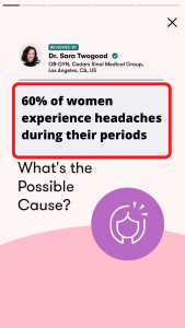
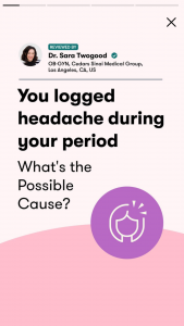
The promotion starts with a screen that introduces the premium subscription based on the information the user input into the app. I chose to add a follow-up screen that would further highlight the benefits of a premium subscription.
I searched for a common statistic about women, headaches, and their cycle. I created a second graphic to build off that information to emphasize a customized experience for the user.
This simple statistic helps normalize the user’s experience which ultimately shows how the subscription can impact their lives.
To learn more the user is motivated to click through.
Revising and writing
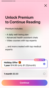
To create a bulleted list of specific and relevant benefits of the app’s subscription I went to FLO’s website. I researched the premium subscription and did a comparison of it and the free subscription. I found the most notable differences to be:
- Chat function
- Personalized feedback
- Unlimited access to Flo Health Assistant
- A network of 80+ health and medical experts
- Video courses, audio, and articles from experts
- In-depth tracking and analysis of mood, energy, skin, and fitness level
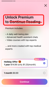
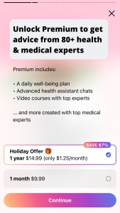
Using this information I found from FLO’s website I created a new list of benefits, starting with the headline:
Get advice from 80+ health and medical experts
This headline creates authority with the mention of health and medical experts. It also creates exclusivity. To access this network and community of experts, you need a premium subscription.

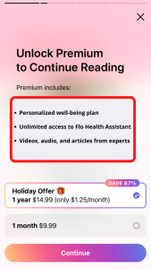
I used the website’s information to revise the bullet list to include specific and relevant advantages and features of the premium subscription.
I removed the generic verbiage such as “…and more…” and instead listed specific benefits like personalization, unlimited access, and educational content.
The purpose of this bullet list was to define the concerns users might have and then map out practical ways this app can address and solve those concerns.
Calls-to-action
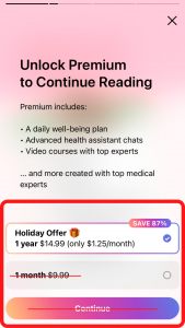
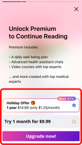
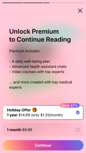
I updated two calls-to-action in a direct and encouraging way.
This sequence has a lot of information and I wanted the calls-to-action to be simple and direct. The purpose of this sequence is to have the user upgrade their subscription, so I tell the user to do exactly that.
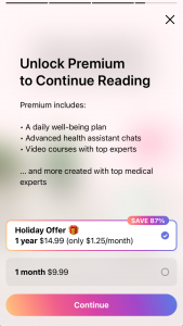
I also invite the user to “try” the subscription without committing to an entire year.
The Metrics
The metrics I would use to measure the success of these updates and changes would be:
Completion rate:
- How far do users advance through the entire sequence?
Overall engagement:
- How long do users stay on one screen?
- How many users exit the sequence and at what point do they exit.
Conversions:
- How many users upgrade their subscriptions compared to previous time periods.
I would also monitor customer feedback, reviews, and frustrations.
Outcome: The new sequence

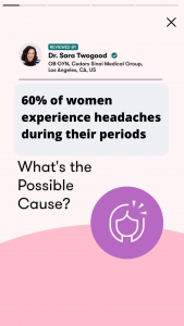


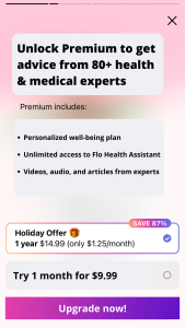
While revising the copywriting of the promotion sequence I didn’t want to overwhelm the user with too much information. However, I wanted to make sure the value of the premium subscription was clear.
By adding an extra graphic, you are able to give users a small taste of the knowledge, information, and advice they will receive by upgrading.
By creating a specific list of subscription features, you are able to quickly communicate to users how an upgrade will impact their lives. You can spark curiosity by listing a new advantage as they click through the promotion.
The problem of repetition was solved. The specific content encourages users to take action.
Overall, this new sequence creates a more customized experience.
